In good Company
Case Study
If you’ve read the case studies on this page, you might be wondering: another recruiter? Yes, another recruiter. After epunkt, Talentor and eRecruiter, Swiss recruiter Coopers is the fourth recruiter that wants to work with me on its brand. At least if you look at the past few years, because there are actually even more. So I’m familiar with the industry and its challenges. It stands to reason that I can do this.
Or does it not?
Because right at the outset, the Coopers ask me a simple but obvious question that completely shatters the framework in my head:
"Can you do that? I mean, make something new?
Aren't you running out of ideas?"
Of course, I shake my head and smile away the question as best I can. But my brain is starting to do its work: It loves being busy – especially when it’s pointless.
I feel like I’m in that scene from Inception (2010) where a thought is described as a virus: persistent and highly contagious. And I’m working on a question that will haunt me throughout the project: How do you come up with something new for a subject you’ve covered half a dozen times?
From a rational point of view, it’s an exciting challenge. But I’m anything but rational when it comes to issues that affect me and my patterns. I am much more a fan of artificial pressure. And so the project becomes an emotional ride on a rollercoaster – into the valley of despair and back again.
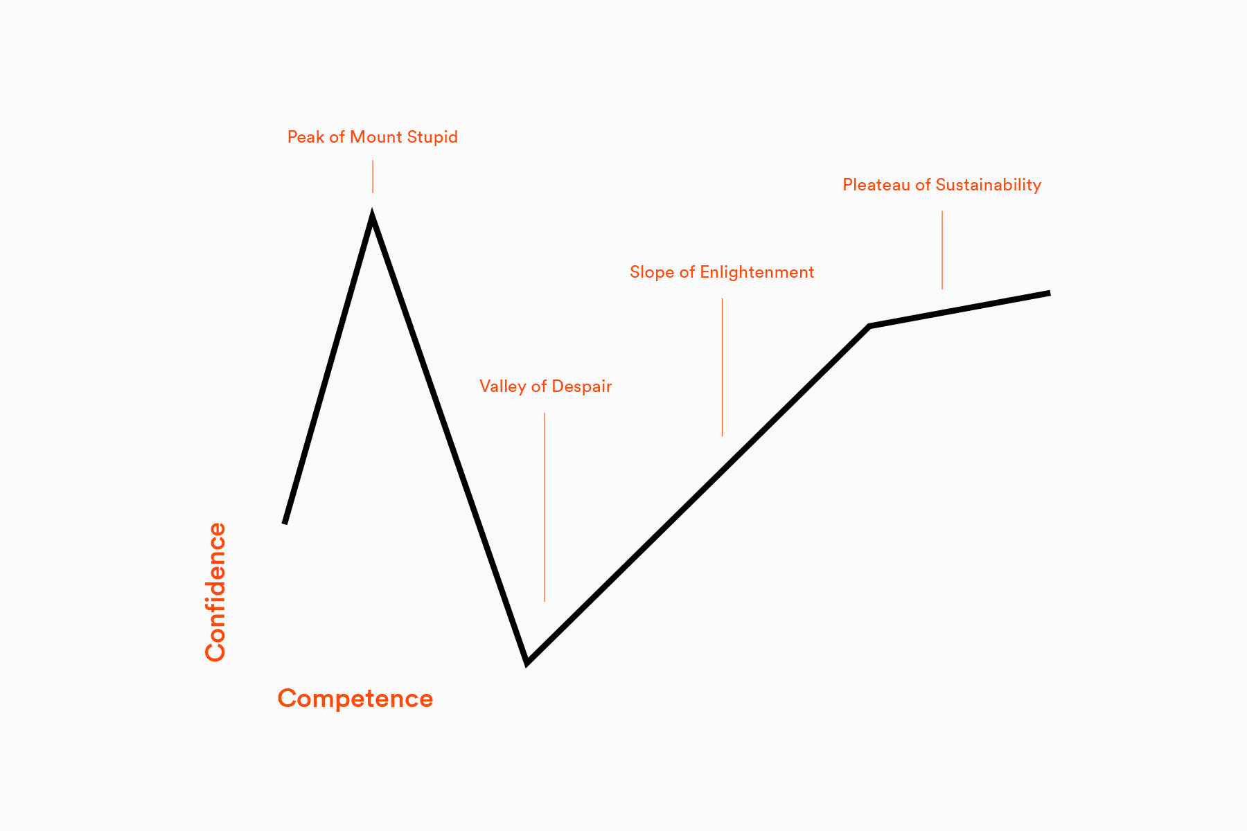
The Dunning Kruger effect aka "the Valley of Despair"
Design: Florian Hämmerle
A case study is always an abbreviation. So I’ll warn you right away: I’m leaving a lot of things out. There’s no other way in such a complex project anyways. Instead, I would like to pass on a question that has kept me busy for the entire project:
What is originality?
Uninformed Optimism
The first few days and weeks are very encouraging.
Although the online survey still shows a relatively diffuse self-image, this is no longer surprising after the first workshop, as Coopers brings together people from a wide range of backgrounds – independent thinkers (and doers) with different origins and very individual perspectives. The company is a prime example of diversity.
For the staff, Coopers is not a business but a family, in which each member plays an important role that cannot be easily replaced.
The term “the Coopers” is used repeatedly (note the plural). And their shared values have their own labels: “Coopers Spirit” stands for the one value system that respects differences and thus makes them possible; “Coopers Care” describes the mission that Coopers ascribes to itself. And new candidates are welcomed as part of the “Coopers Family”.
So it seems easy to pin down Coopers’ identity: After all, they’ve already done it very successfully. The Coopers like to reflect, know themselves well and are good at communicating this to others. Recruiters are very talkative people after all.
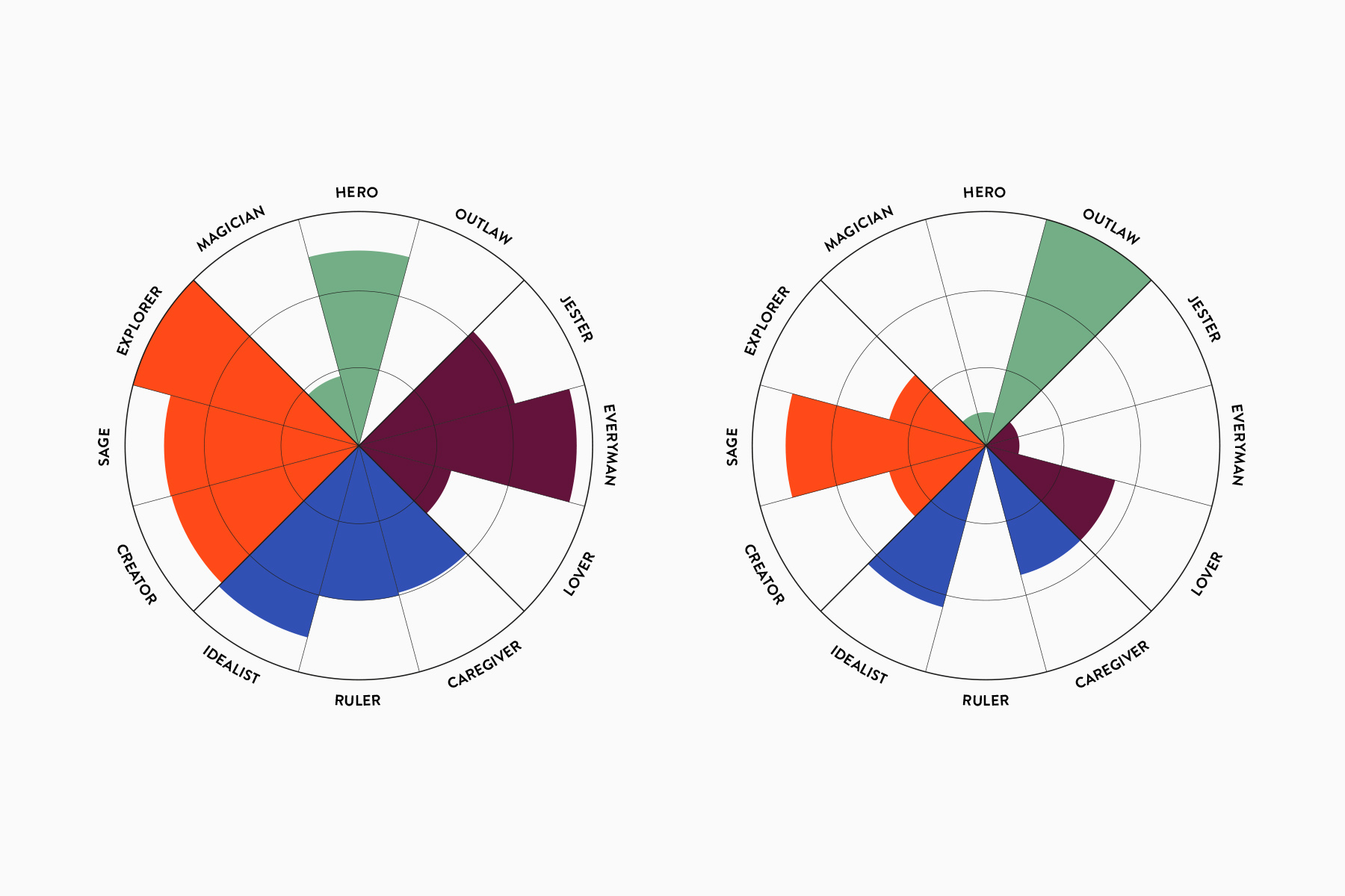
Quantitative and qualitative results contradict each other at first glance.
Design: Florian Hämmerle
Coopers specialises in the recruitment of domestic and international contractors. In simple terms, a candidate is hired by the recruiter and then loaned to the client for a period of time.
Entrepreneurs want to build broad experience, work on different projects, take on new challenges, develop personally and expand their project portfolio. For that, they follow a path without a safety net. When a contract ends, they simply look for a new one.
The recruiter’s role is all-encompassing: they help contractors find a client. They are the first contact in an unfamiliar environment. During the contract they serves as an advisor, companion and mentor. And when a contract ends, they help find a new one.
This often leads to a long-term relationships and a close bond between recruiter and candidate. As a Coopers manager put it:
"Candidates coming from abroad have to find their way around Switzerland and its particularities. The recruiter is the first friend they meet on this journey. And friends try to help, no matter what."
This aspect is powerful as fear, worry and hardship are great motivators and de-motivators for human beings. In other words: Companies who not only take their clients fears seriously, but can also answer them, become relevant – on a factual, but also on an emotional level – the level of brands.
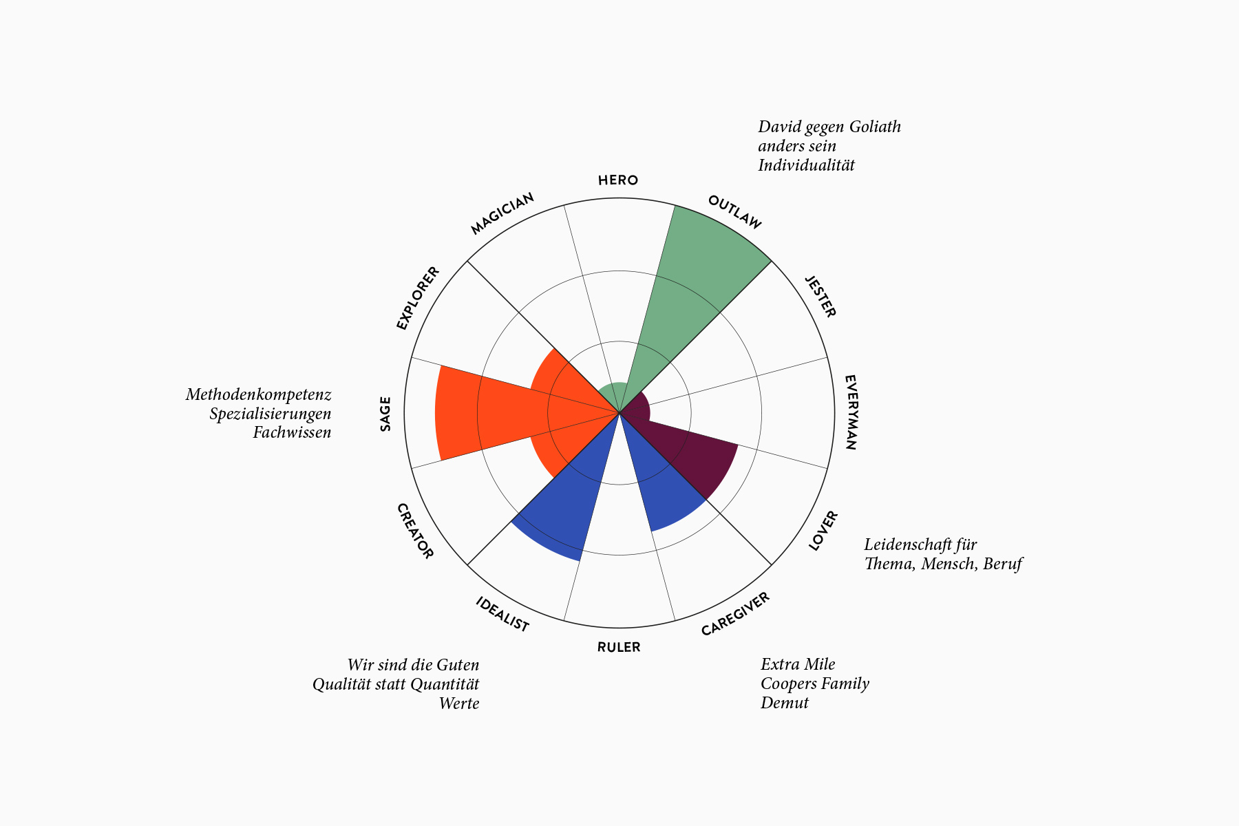
There is a fine line between individuality and rebellion in Switzerland.
Design: Florian Hämmerle
To take a closer look, I develop several personas with the staff, which we send on C. Vogler’s hero’s journey. The aim is to identify those moments that are particularly frightening or inspiring for candidates: key steps on their journey. The results are surprising (at least to me) because they are only indirectly related to the actual process.
An employee tells me that she recently helped a contractor from Italy to find a flat in Basel. I don't know what impresses me more: the fact itself. Or how casually she mentions it.
The Coopers help for very personal reasons. And this goes far beyond the expected service. It ranges from support with contracts, translations, official business and errands to very personal challenges, such as finding a new home.
This is a great quality, because a change of job brings massive changes to an individual’s life. Cooper’s profession has consequences. And the company is always aware of the responsibility that comes along with it.
Coopers Care creates the space for employees to do more than just their job. Their performance is measured not only in terms of the results they deliver, but also on an individual and idealistic level: for example, how they define their role as a recruiter and how they want to contribute to the lives of others. Coopers Care creates meaning.
And it also makes economic sense. Because candidates who have received this kind of attention are happy to come back. The pool of contractors remains full.
Peak of Mt. Stupid
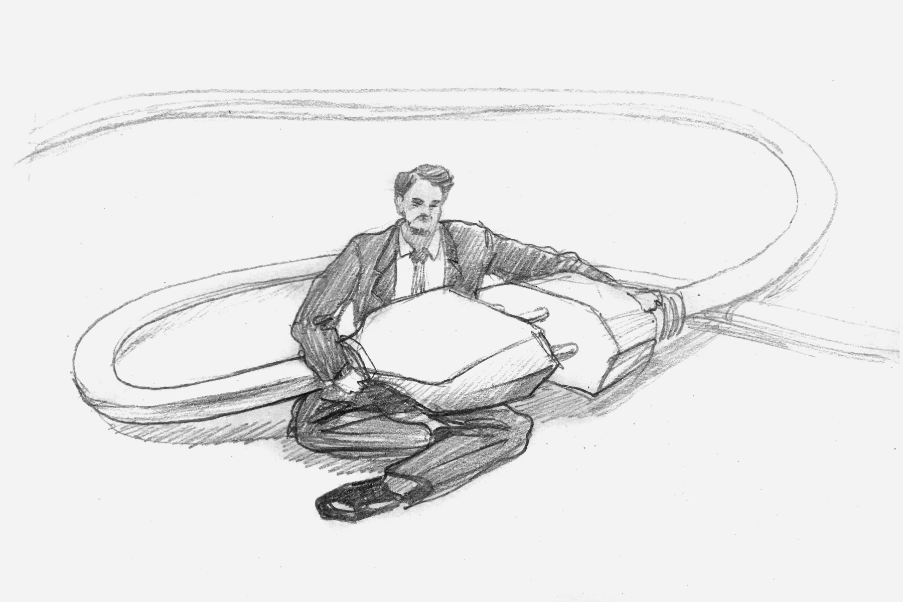
In my first drafts, I build a world of images and statements based on Cooper’s Care. Another aspect is intended to lend the idea the necessary lightness and quotes the charming rebel: The staff describe Coopers as underdogs who are proud to piss off the big players once in a while, as one employee laughingly admits.
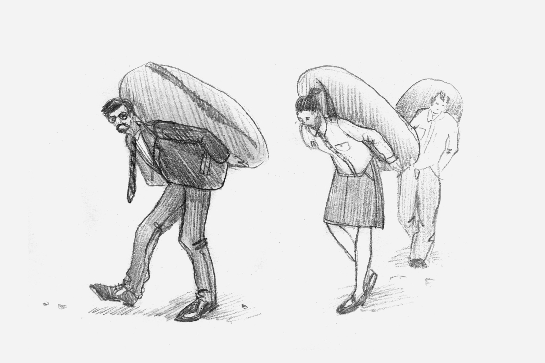
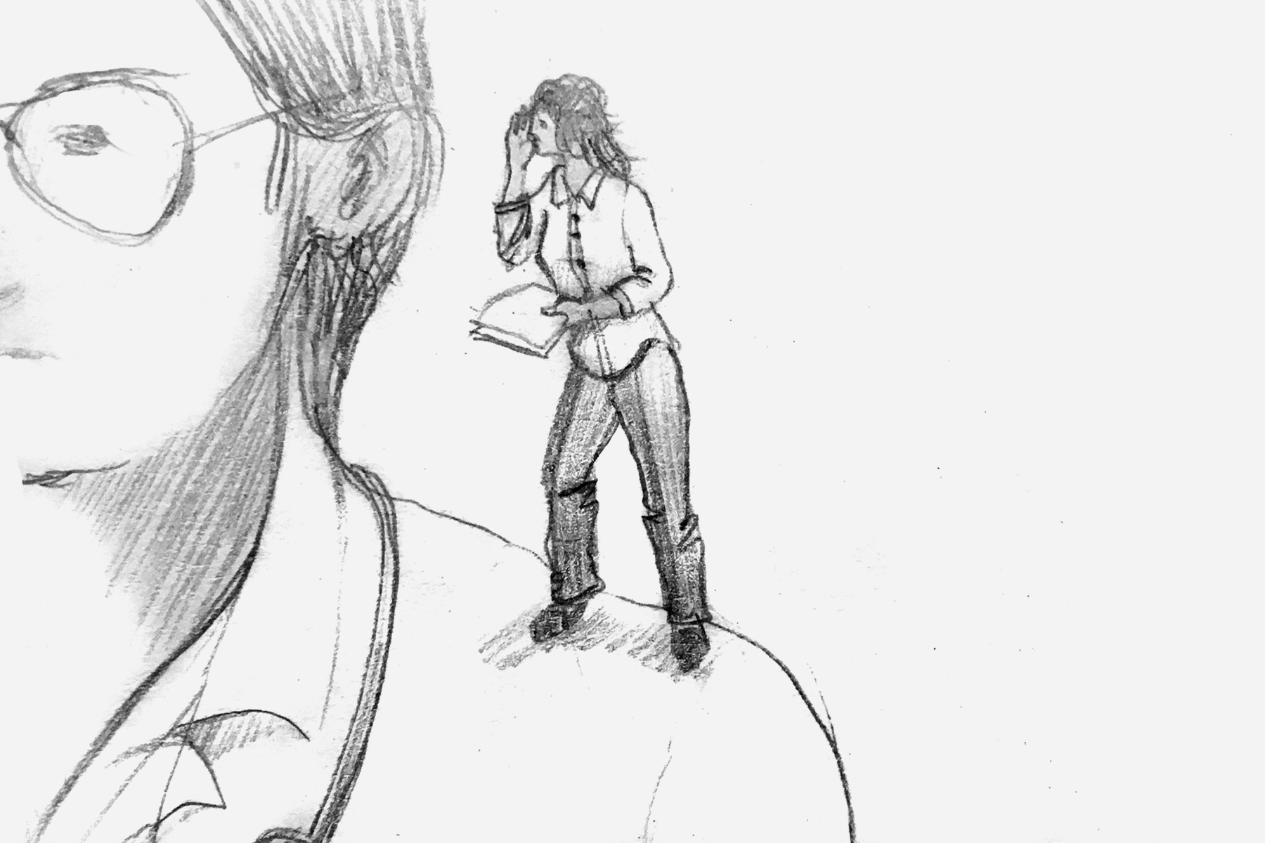
In my idea, the Coopers become a family of shirt-sleeved brownies who solve the challenges and problems of their clients and candidates almost in secret. Shrunk down using Photoshop, the employees become the stars of imagery. They interact with people of real size, playing prompters in job interviews or sourcing in places where no one has ever thought of sourcing before – under the carpet, for example.
With the help of graphic designer and concept artist Andrea Holzner, an unusual pool of funny, absurd and charming ideas quickly comes together, which thematises the agility and flexibility of the Coopers, but also remains refreshingly down-to-earth. Graphic designer Daryna Eder illustrates the approaches with sketches – accompanied by rough texts, which, just like the visual level, are intended to live from one thing above all: Irritation.
So I fly to Basel completely euphoric and, for once, don’t expect the worst.
The response is a hearty "aha". Then a lively discussion ensues. The first person likes it, the other doesn't. And later it's suddenly reversed.
It’s obvious we have a problem, but it’s not immediately clear what it is. Flying back, I stare at the clouds. I feel heavy.
A few tough, seemingly endless weeks follow. By the time I finally get the relieving ‘no’, I have long since realised what the problem actually is: The miniatures.
The Coopers do not want to be perceived as “small”. Small suggests a small reach and perhaps even a workforce that is too small to handle larger contracts efficiently. Even in factual terms, “small” is not correct: among Swiss recruiters, the company is one of the larger ones. It is only small compared to its international competitors, i.e. the part of the market that the Coopers like to toy with.
The objection is understandable. However, this also marks the end of the whole idea.
The Valley of Despair
It’s interesting how time changes us. Ten years ago, I would have fought for the idea and tried to push it through somehow. I would have convinced myself that the customer simply didn’t understand and would have argued for my life.
Design is part of my identity. So a 'no' can be very hurtful. The client doesn't just reject an idea, it feels like they're rejecting me.
That sounds incredibly dramatic. At the same time, I know that many designers are aware of this mechanism, but may express it differently. And no, I don’t know how to switch it off. But I am starting to accept it as part of me. That makes things a lot easier.
Because it’s actually like this: A brand is merely an expression of an identity. If a client cannot identify with an idea, it is not doing its purpose. Rejection provides new information on how a goal can be achieved. And more importantly: where the goal lies in the first place.
I don't always succeed in taking this view. Because it is actually far too rational to be my own. Even today, I still fall into well-worn patterns, only to realise that they still don't work.
So I sit down with the Coopers and take a few steps back to see where the impasse begins. We reflect on the aspects that make the Coopers the Coopers and at the same time shift the focus for the following designs: Cooper’s view of the different facets that make us human; and Cooper’s willingness to challenge the status quo and transform the image of recruitment.
And with that comes the real challenge for me personally. Because the positioning we are defining for Coopers reminds me strikingly of epunkt. And that triggers the first thought that I have so nicely put to bed:
"Can you do that? I mean, make something new?
Aren't you running out of ideas?"
So I stare at a blank sheet of paper and feel blocked. I reflexively discard every thought I’ve ever had before. I want to do something original. And it mustn’t be reminiscent of my previous projects. What’s left isn’t just not good enough: it’s simply not enough.
Welcome to the Valley of Despair.

So I work for hours, days. My thoughts are spinning like a top on a mission. Finally I give up and do the only thing I can think of: I sit down with my neighbour to drink beer.
The Slope of Enlightenment
My neighbour is an interesting person. Some would call him peculiar and that’s exactly what I like about him. He often has surprising opinions and loves to confuse me (or drive me up the wall).
When asked about the dilemma, he just laughs. He pulls out an article he’s read. It’s about Steve Jobs, the iPhone and the question of what constitutes real innovation. Unfortunately, I can only reproduce the passage that impressed me the most from memory:
The first iPhone is rightly considered revolutionary. But touchscreens already existed, as did cameras, pocket computers and mobile phones. Apple did not develop those technologies per se, but brought together existing aspects to create something completely new.
Ok. Wow.
The scales fall from my eyes. A light dawns on me. The penny drops. Isn’t it remarkable how many expressions we humans have for the moment when we finally realise?
So I say goodbye as surprisingly as I arrived (anyone who knows me knows this. Note), rush home, sit down in my study and write a list that I can barely decipher the next day:
- MeiMy perspective on originality is not objective.
- If I avoid characteristics just because they are similar to others, I am concealing part of a personality.
- Coopers and epunkt are not competitors, but international partners. They represent similar values in different markets.
- Elements can be similar. Originality results from the sum of the elements.
- Is epunkt’s astronaut unique? If you search the web, you will certainly find astronauts photographed in everyday situations. But it is unique in the context of recruiting.
The rest is unreadable.
Plateau of Sustainability
You can imagine that it is all uphill from there. I now welcome the similarities with epunkt. I see it as an invitation to build on them and develop something new. And I’m dealing with interesting questions: How do you find new forms of expression for similar attitudes? And how do you combine those with new elements to create something unique?
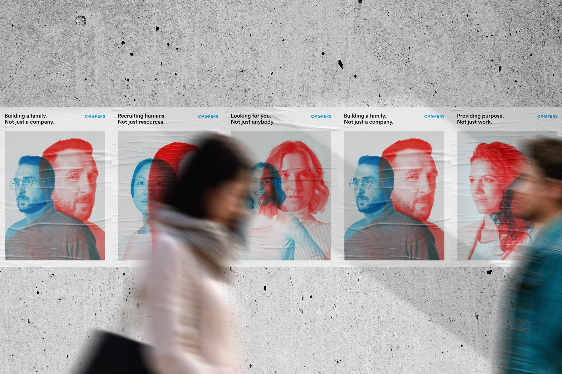
The anchor of Coopers’ new communication is an idea that is also the driving force behind epunkt: People are more than just a resource. But what at epunkt served as a trigger to ask what candidates need as individuals is now approached in a broader sense: The shortcomings of the industry are boldly criticised – especially the unappreciative jargon in recruiting and HR (Human Resources).
The term 'resource' suggests that people are easily replaceable. At a time of skills shortages, this not only sounds presumptuous, it screams denial of reality.
Coopers wants to shake things up. Idealism becomes rebellion. The Coopers’ language should be bold, loud and direct.
To this end, I am developing a system that I refer to as duality. The world of the Coopers plays with opposites, reinterpretations and the odd ambiguity – in other words, an “either/or” and a “both/and”.
The Coopers are the good guys. And they support clients and candidates personally, empathetically and reliably. From this I derive “in good company” – a play on words from the English idiom (“We are a helpful companion on your journey”) and a more literal translation (“We are the good guys”).
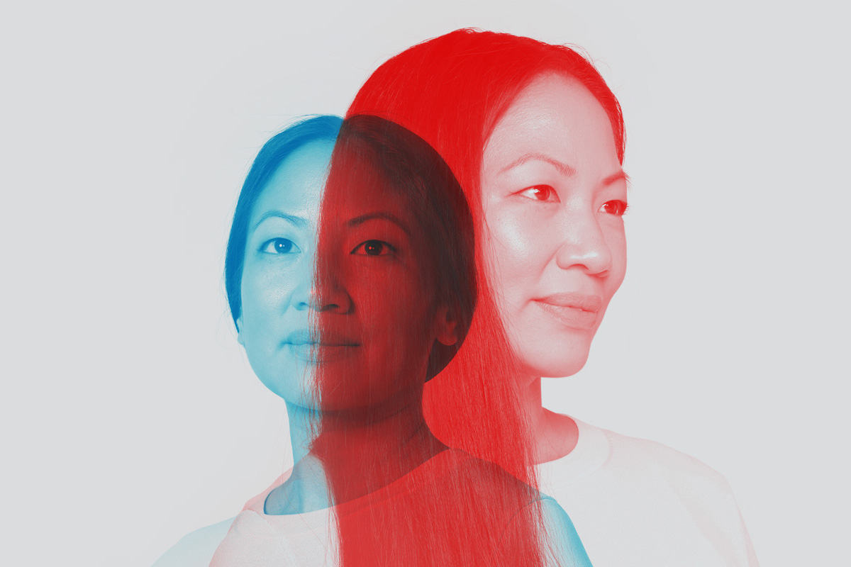
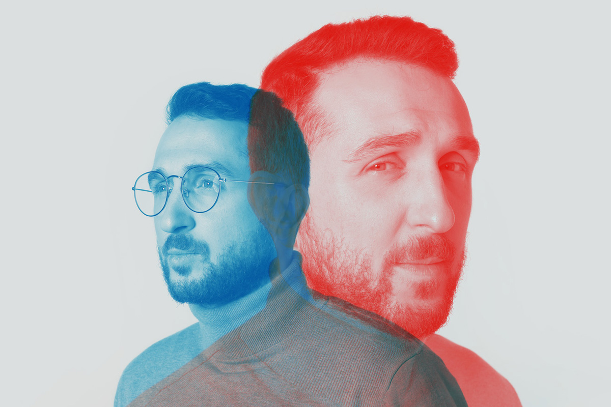
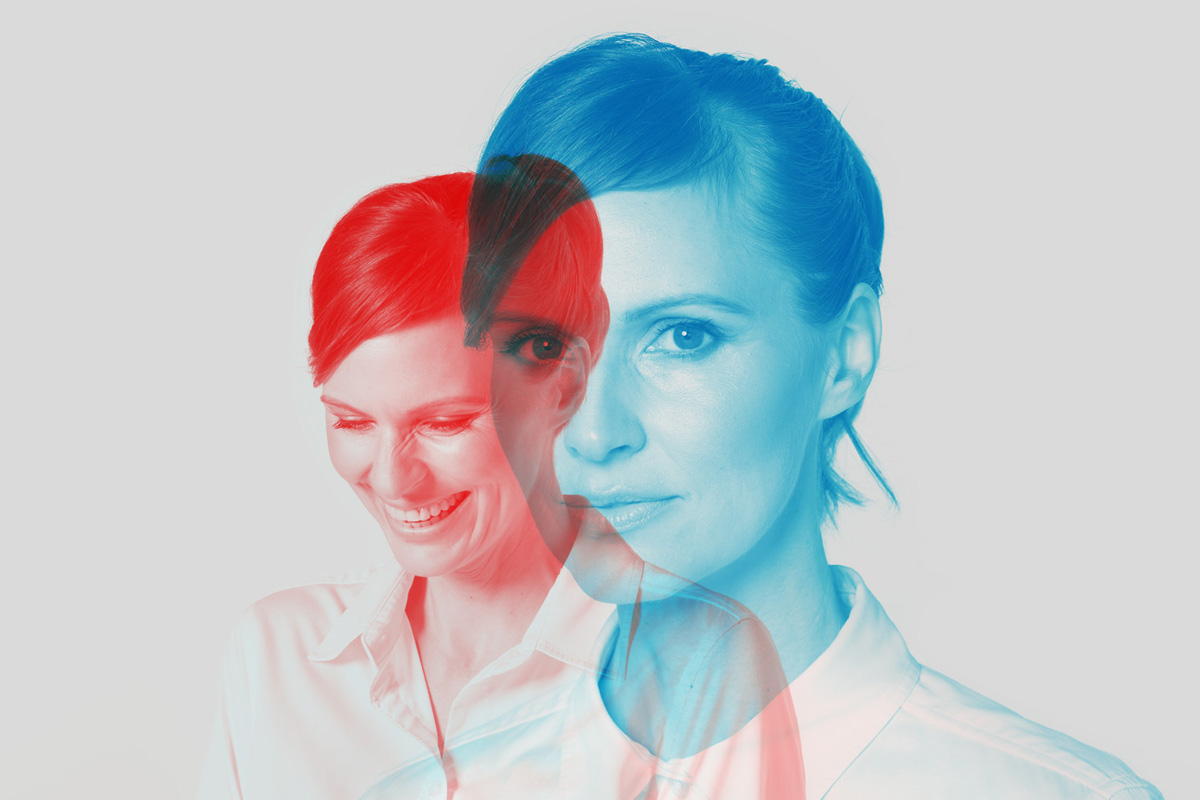
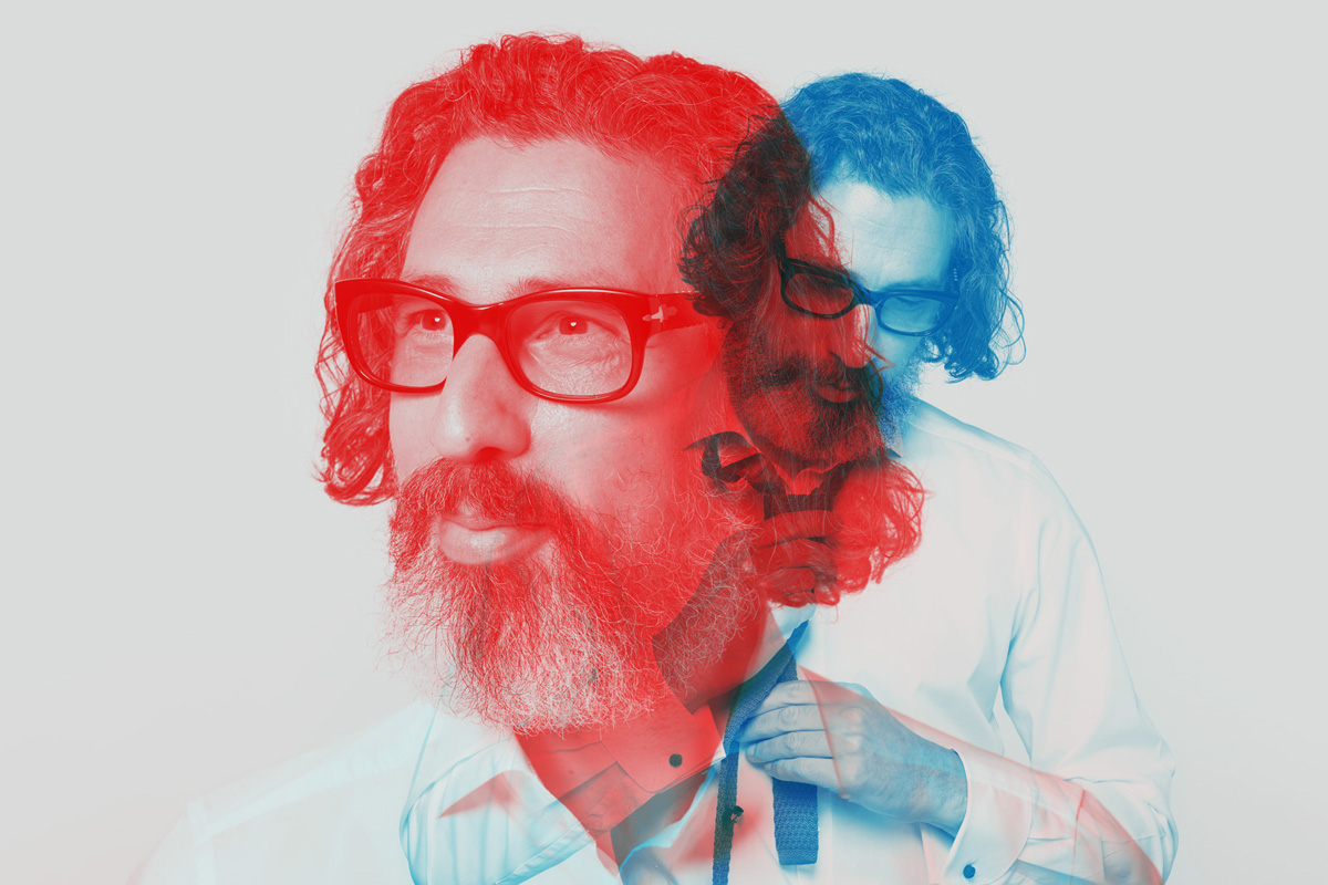
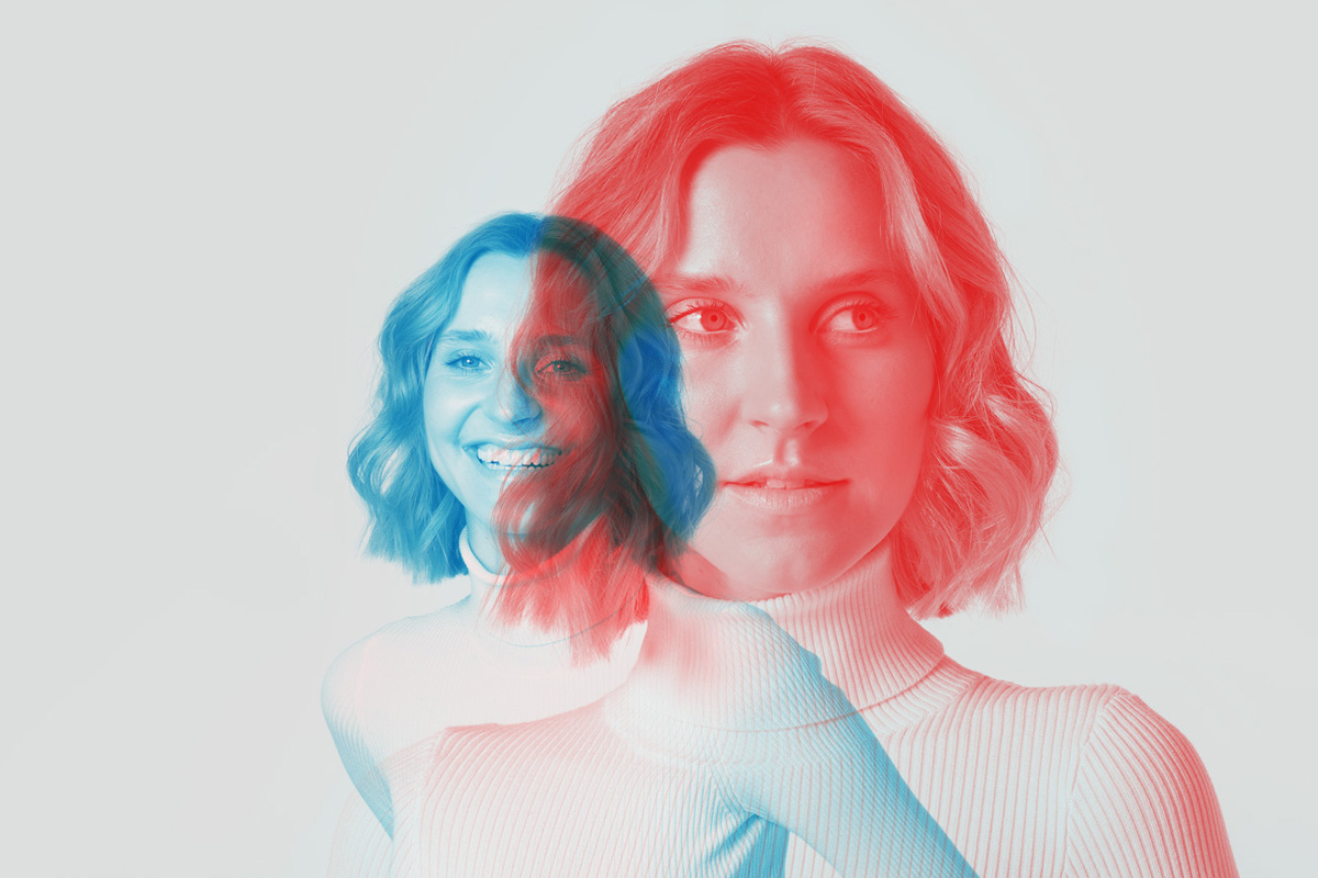
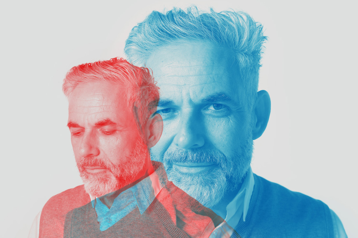
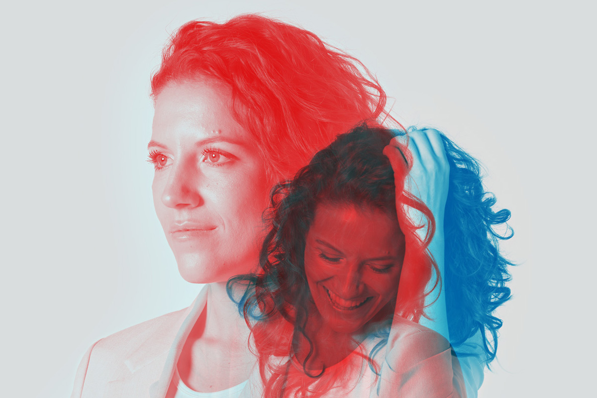
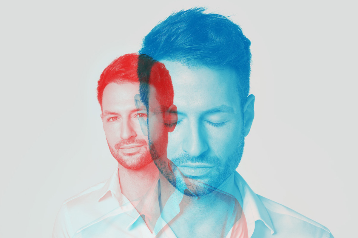
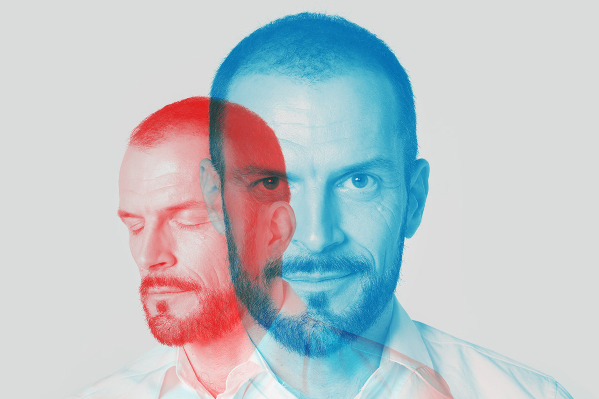
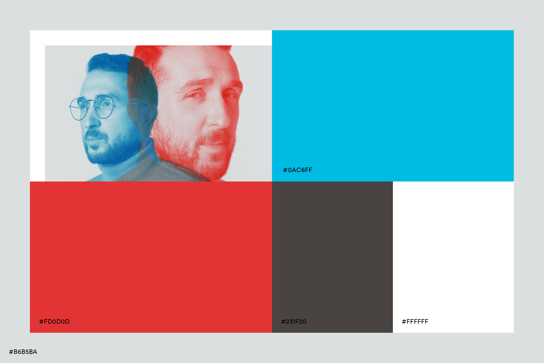
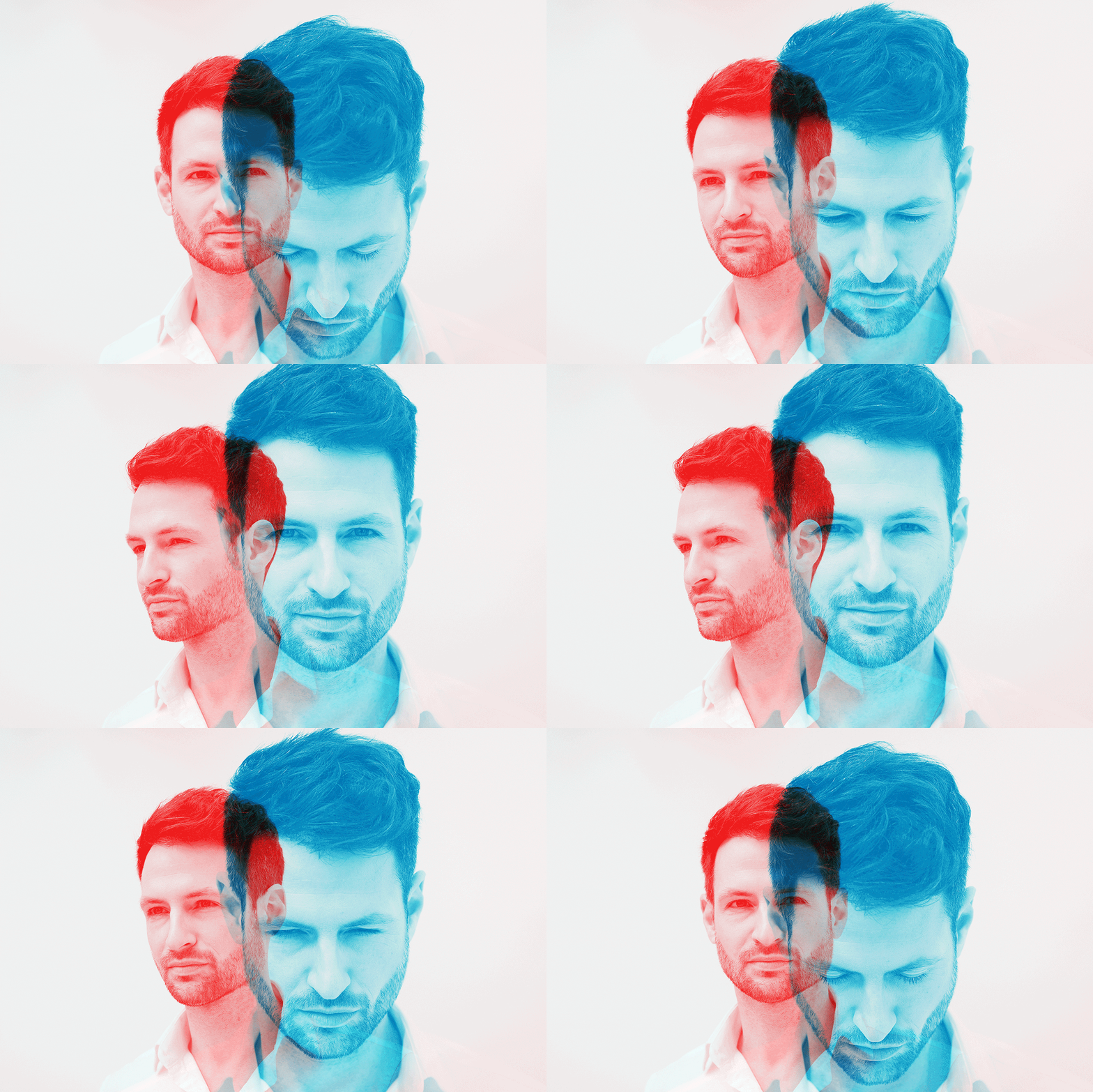
We consider double exposures for the visual world. This stylistic device is as old as photography itself. In the beginning it was a child of chance. A technical error that led to a film being exposed several times. In art it became a planned stylistic device:
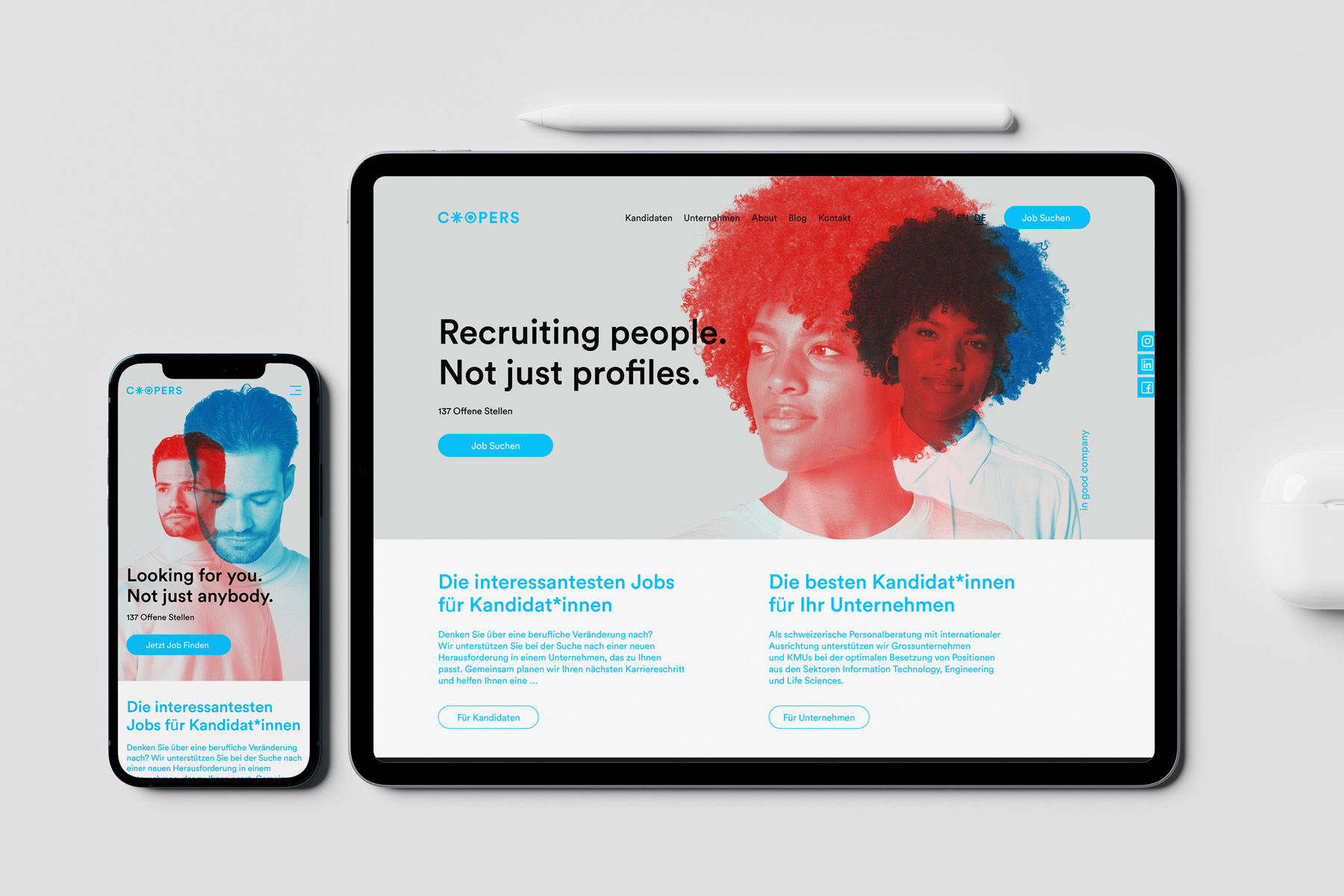
Double exposure allows two levels of reality to be captured in a single image. This allows the image to make more complex statements by relating two motifs to each other: Architecture meets man, nature meets technology, thought meets body.
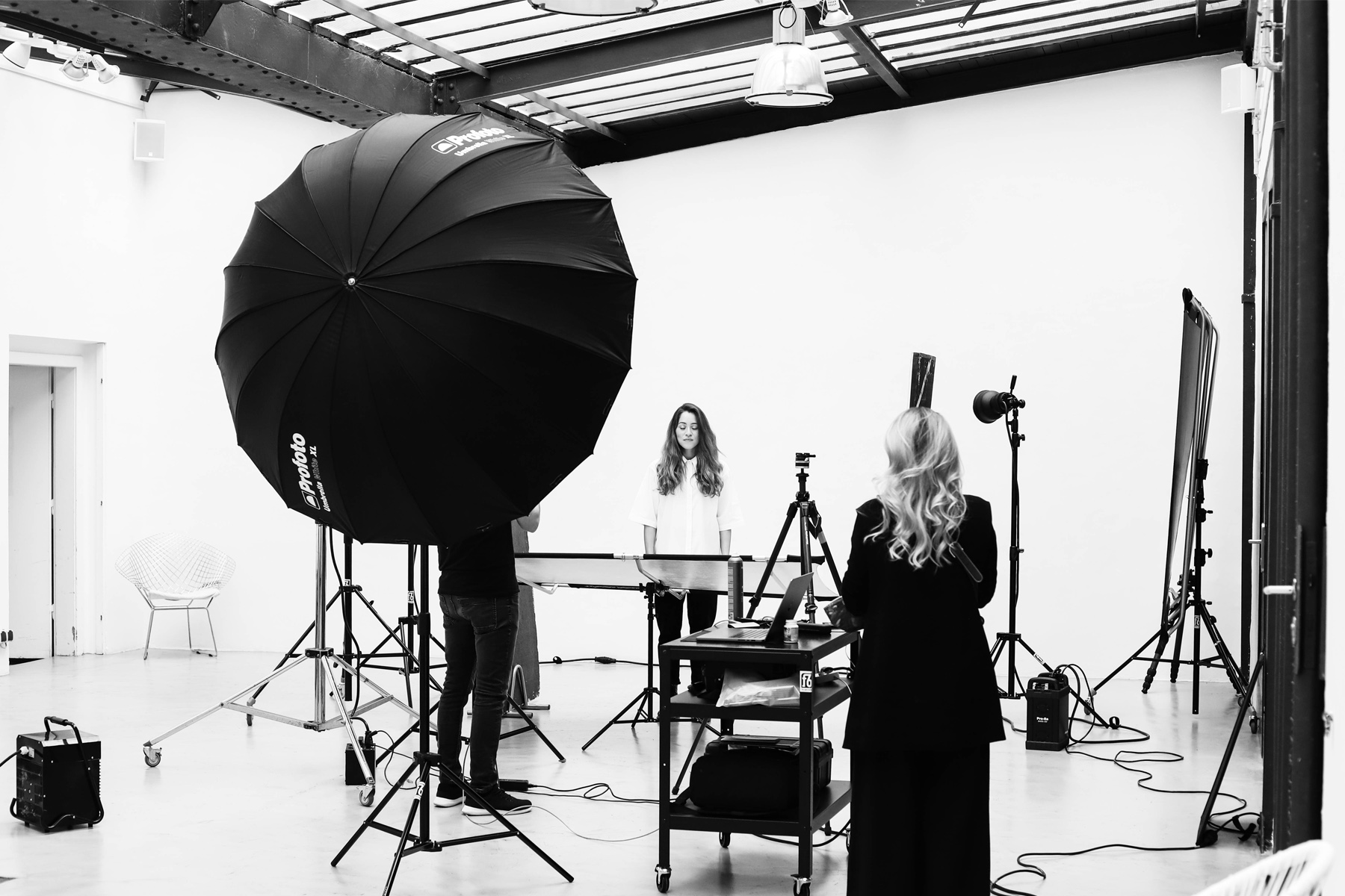
Cooper’s double exposures show two snapshots of one and the same person. The result is an almost intimate glance at the personality behind the subject. Werner Streitfelder, the ‘human whisperer’, has already explored how to capture the essence of a person in his art series ‘2012 Faces’:
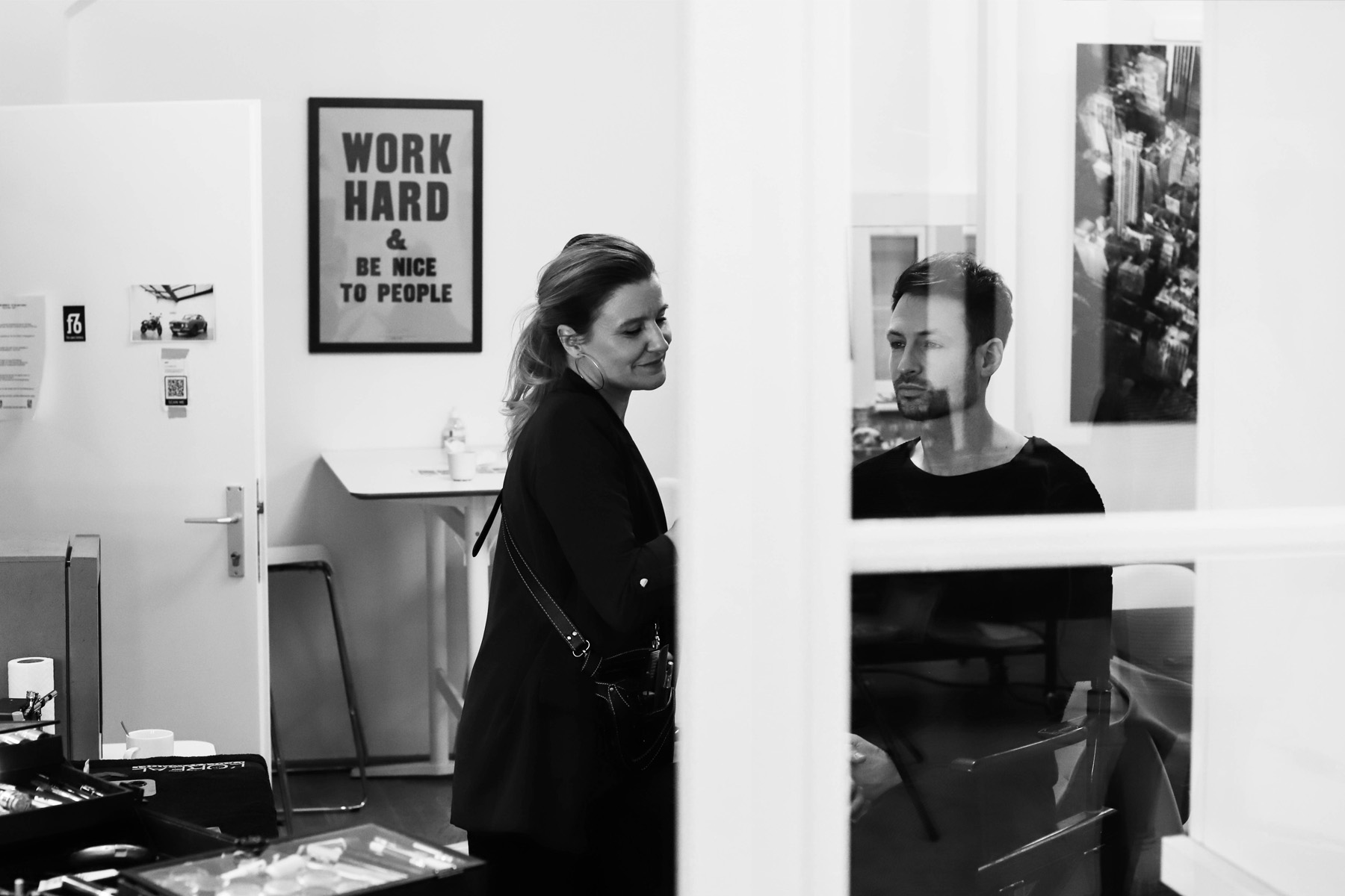
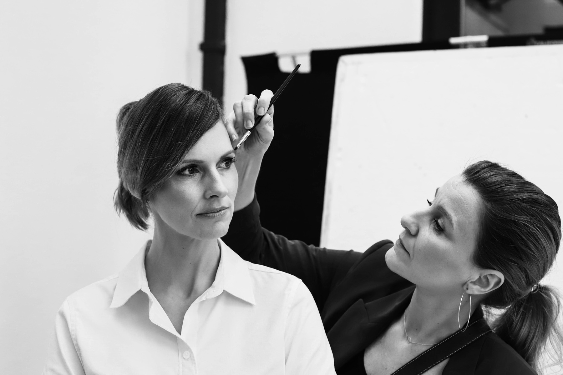
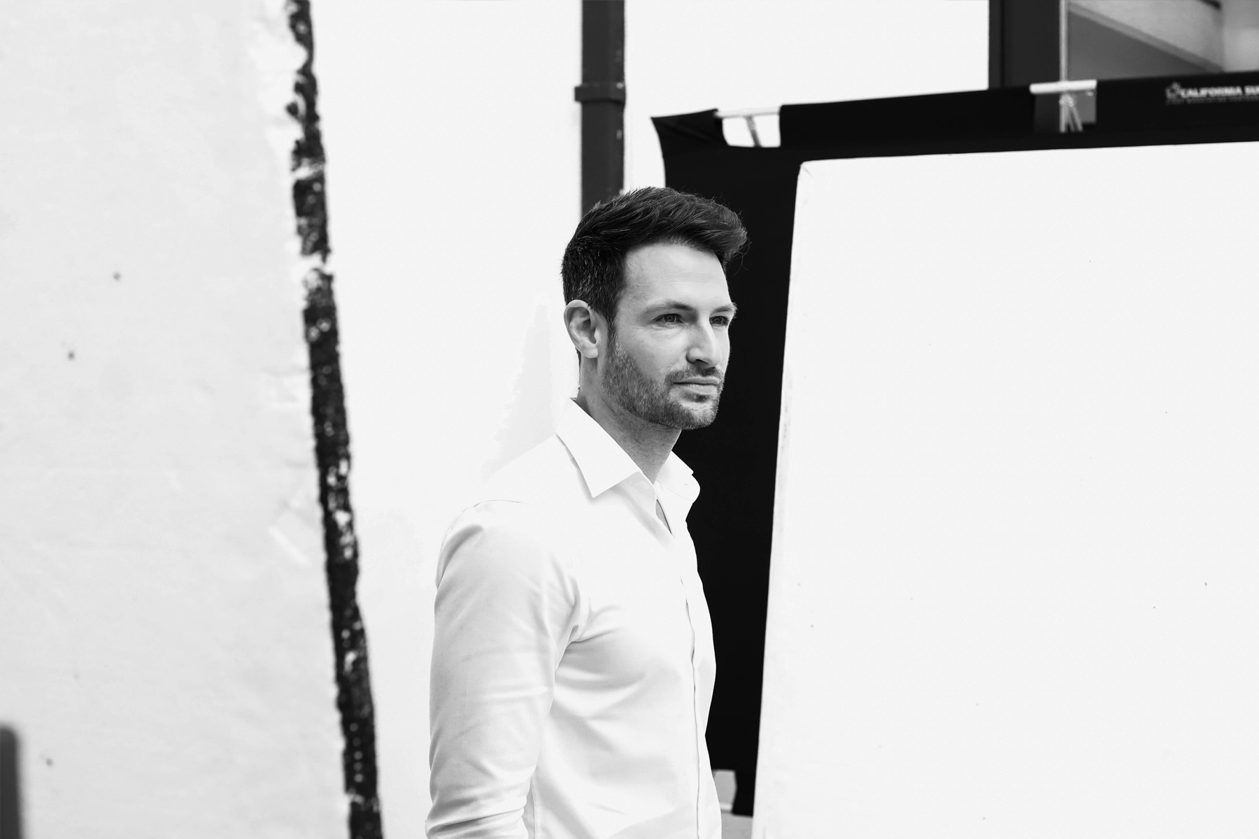
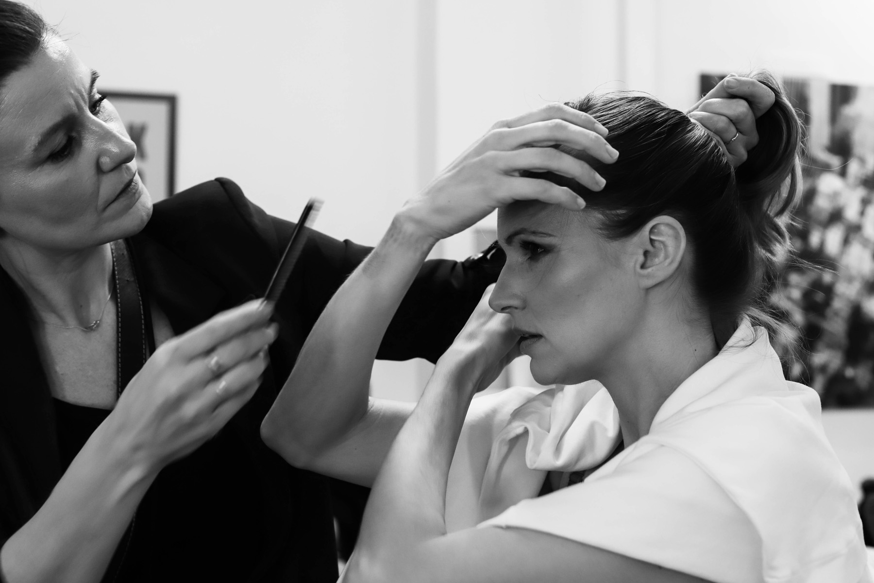
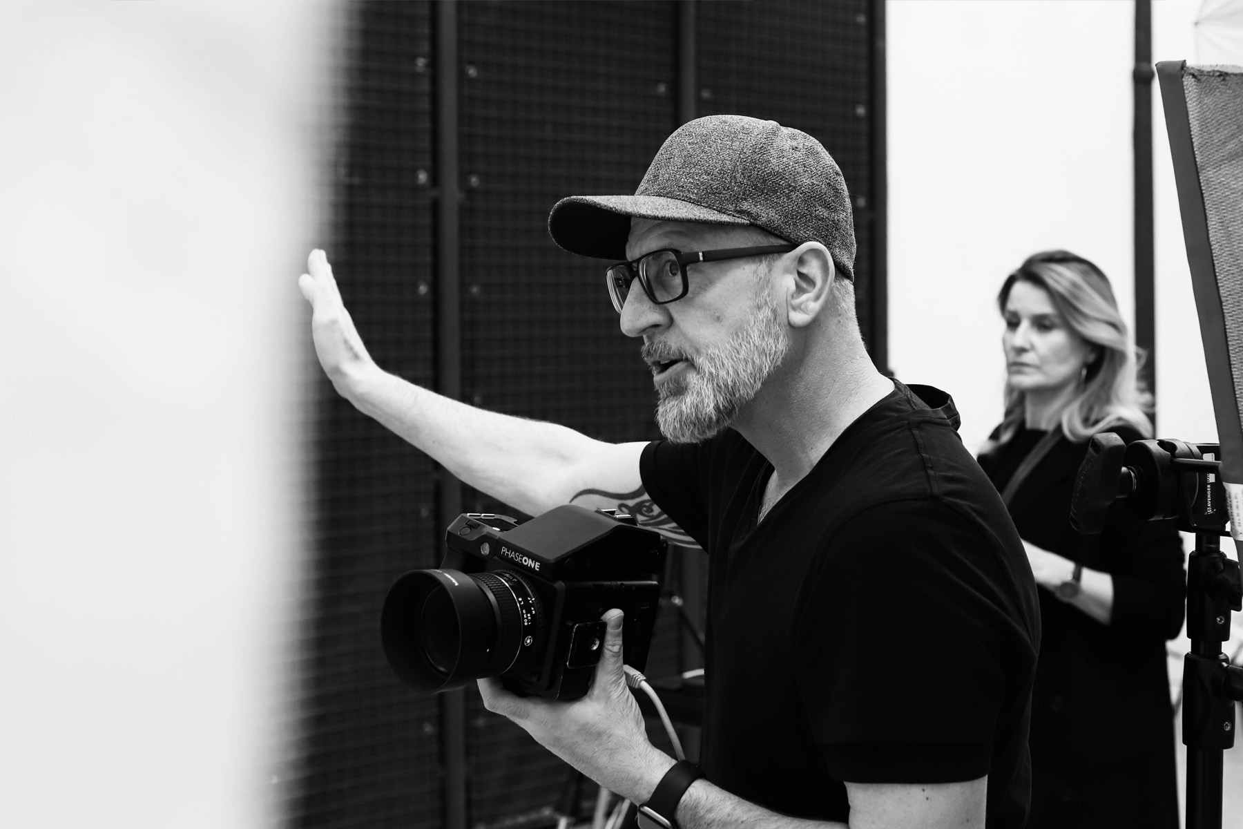
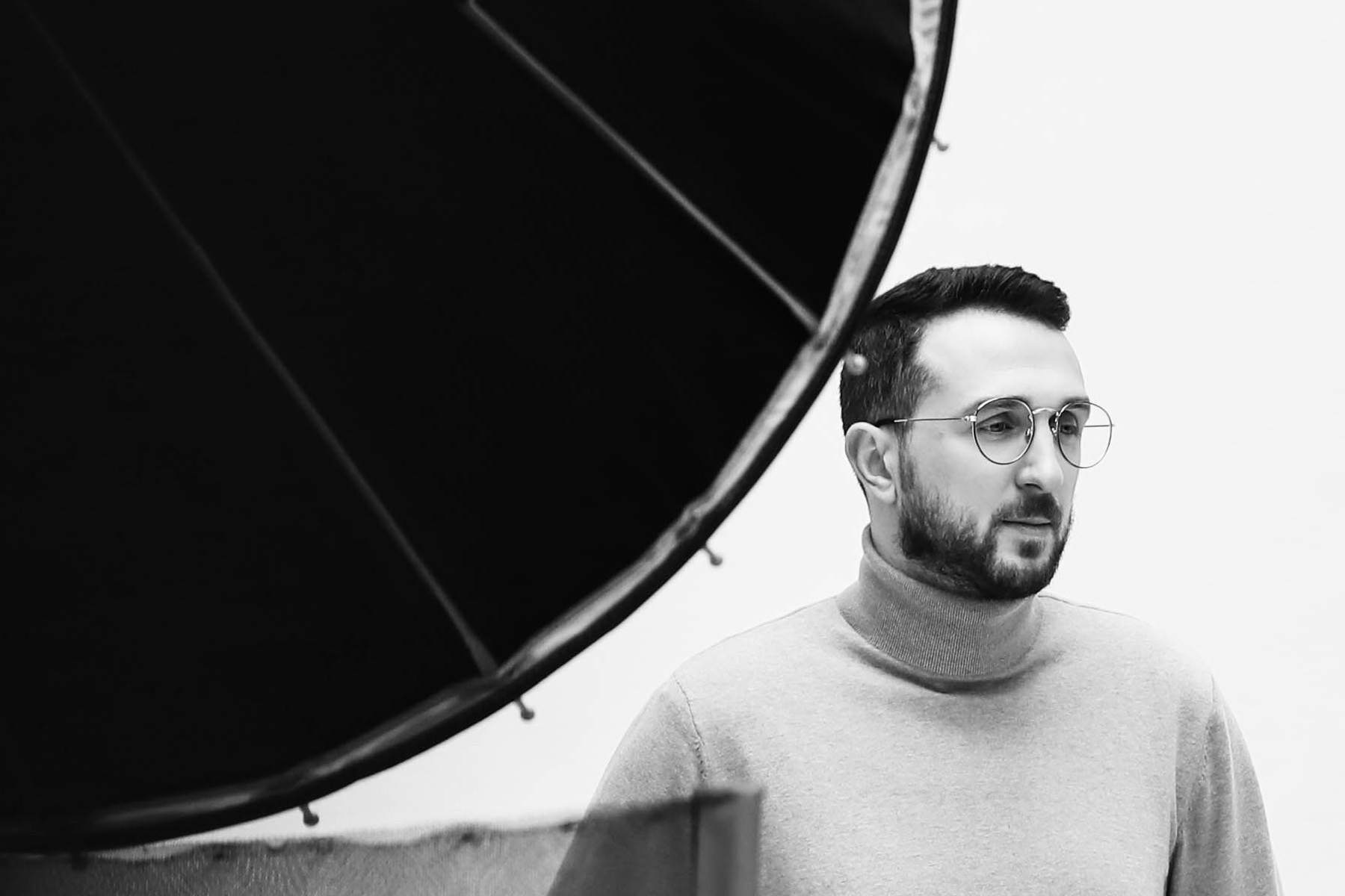
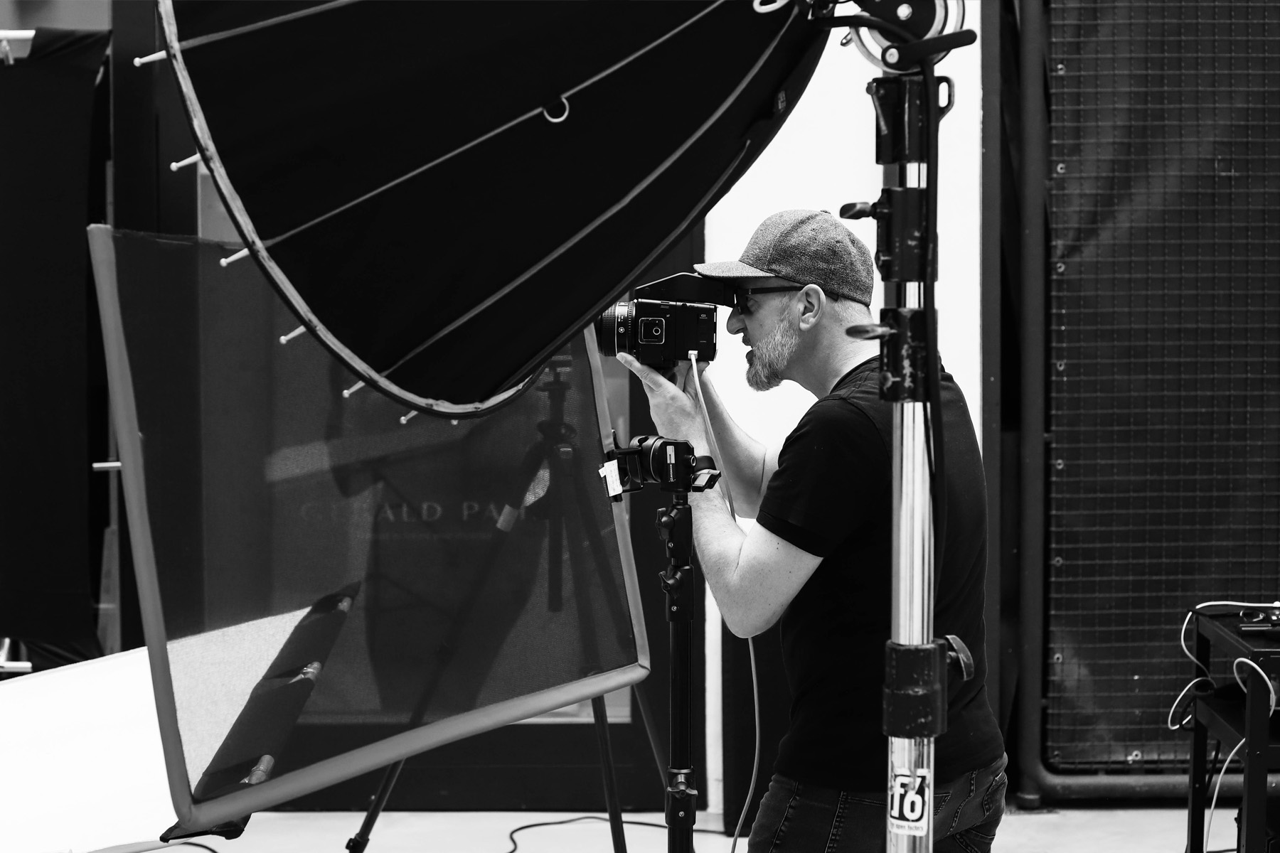
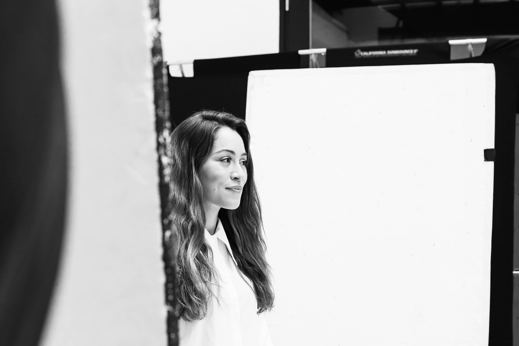
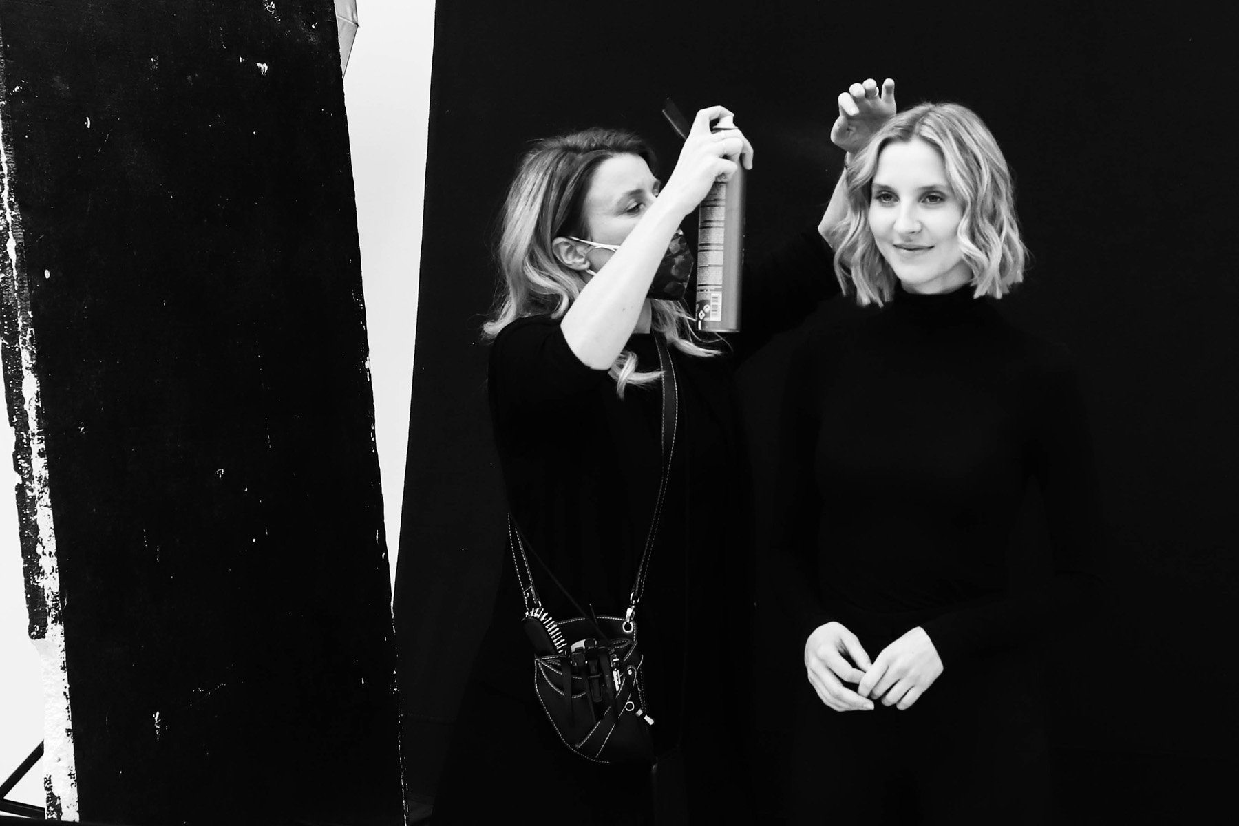
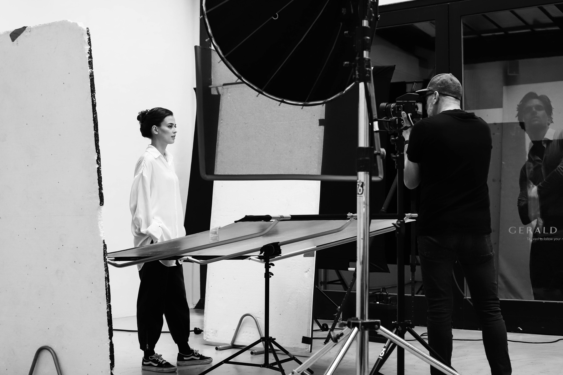
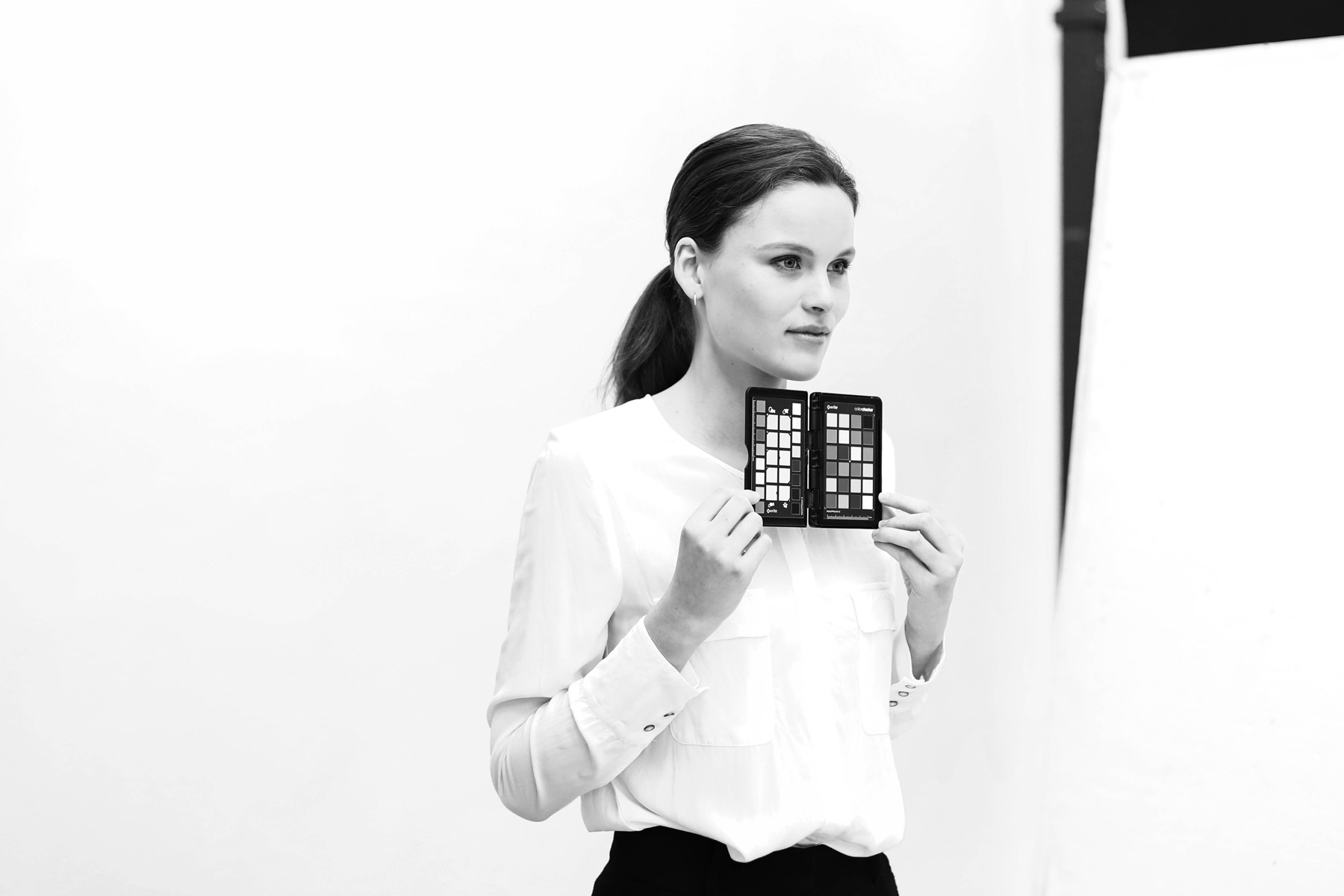
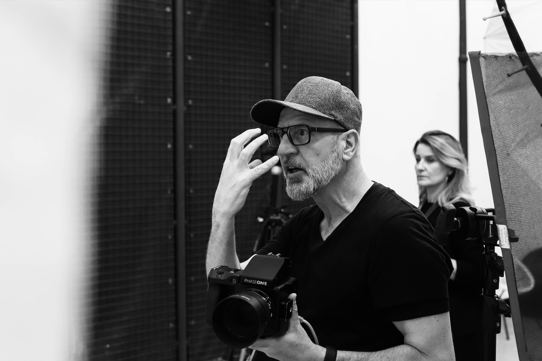
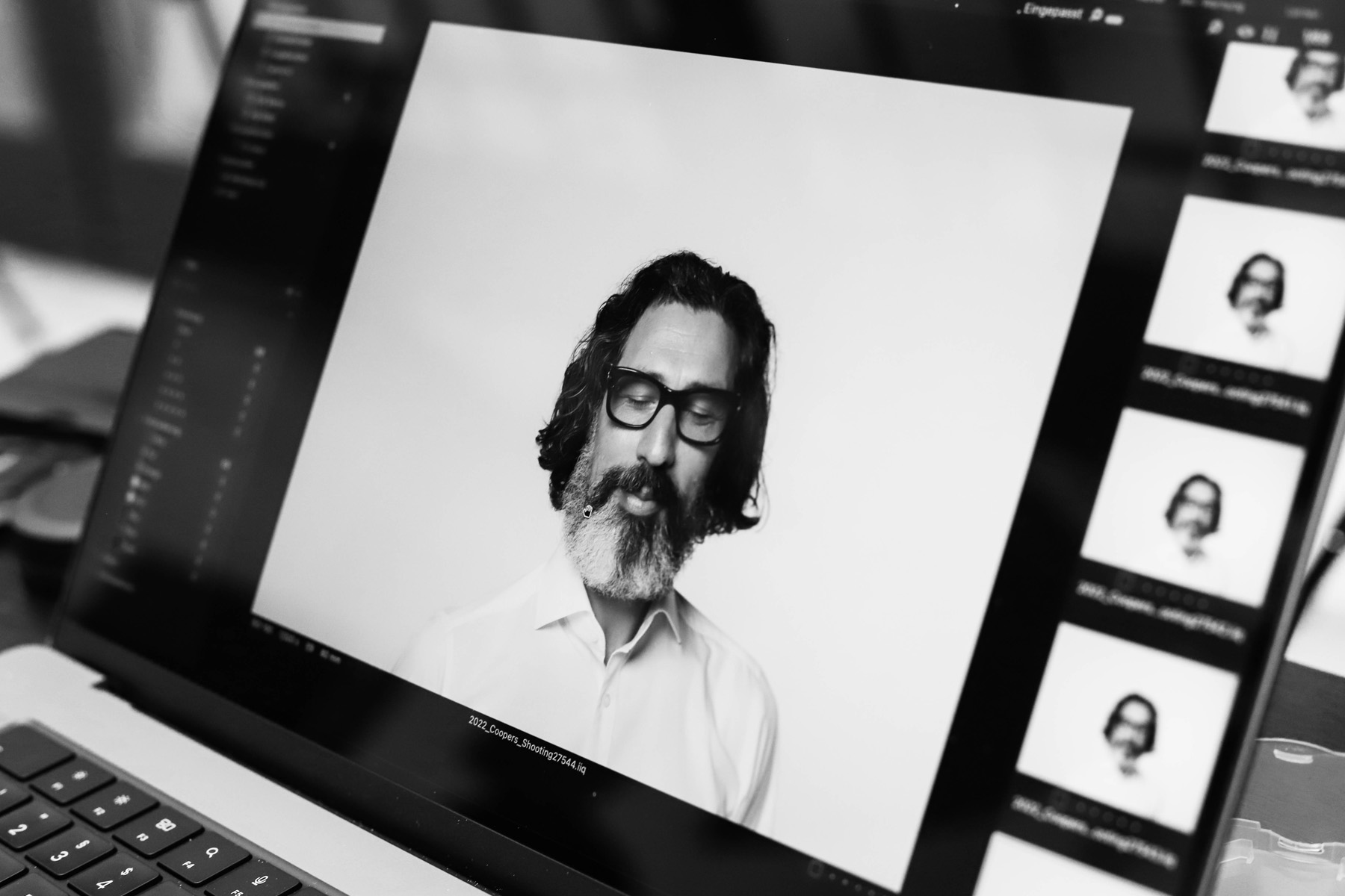
For him, the real moment happens between the stagings. Before a model can adapt to the photographer’s instructions and strike a pose, the first shot has already been taken. And it looks real, the person is just themselves, completely natural. Together with a cast of around twenty people based on Cooper’s personas, a three-day photo shoot is organised in Vienna – a highlight of the project. Not just for us designers, but also for Cooper himself, who flew in from Switzerland for the occasion.
Graphic designer Julia Weithaler is responsible for the art direction and creates a corporate design that brings the different elements together. She introduces two contrasting colours: a subdued, fresh blue and a bold, vibrant red.
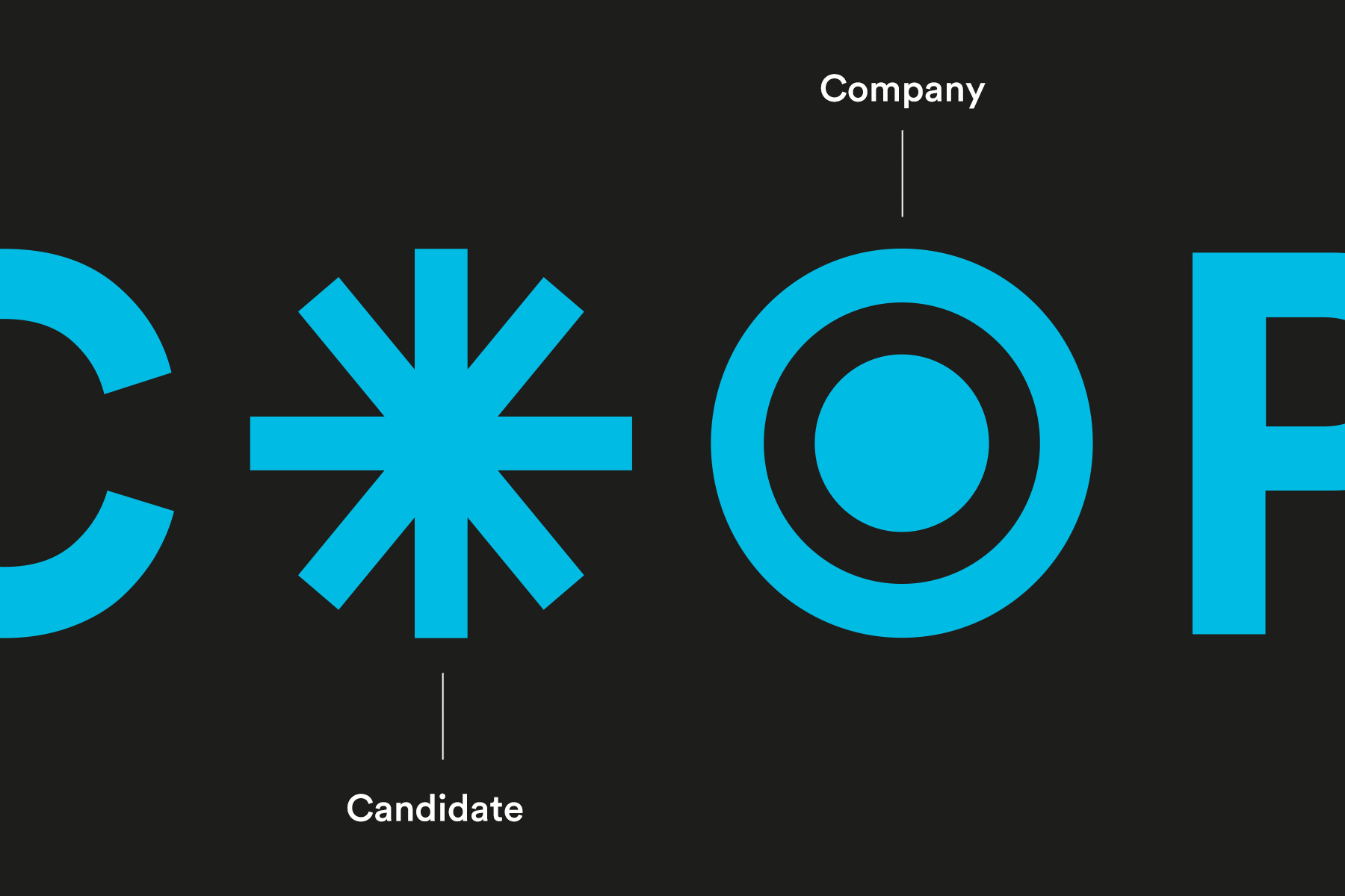
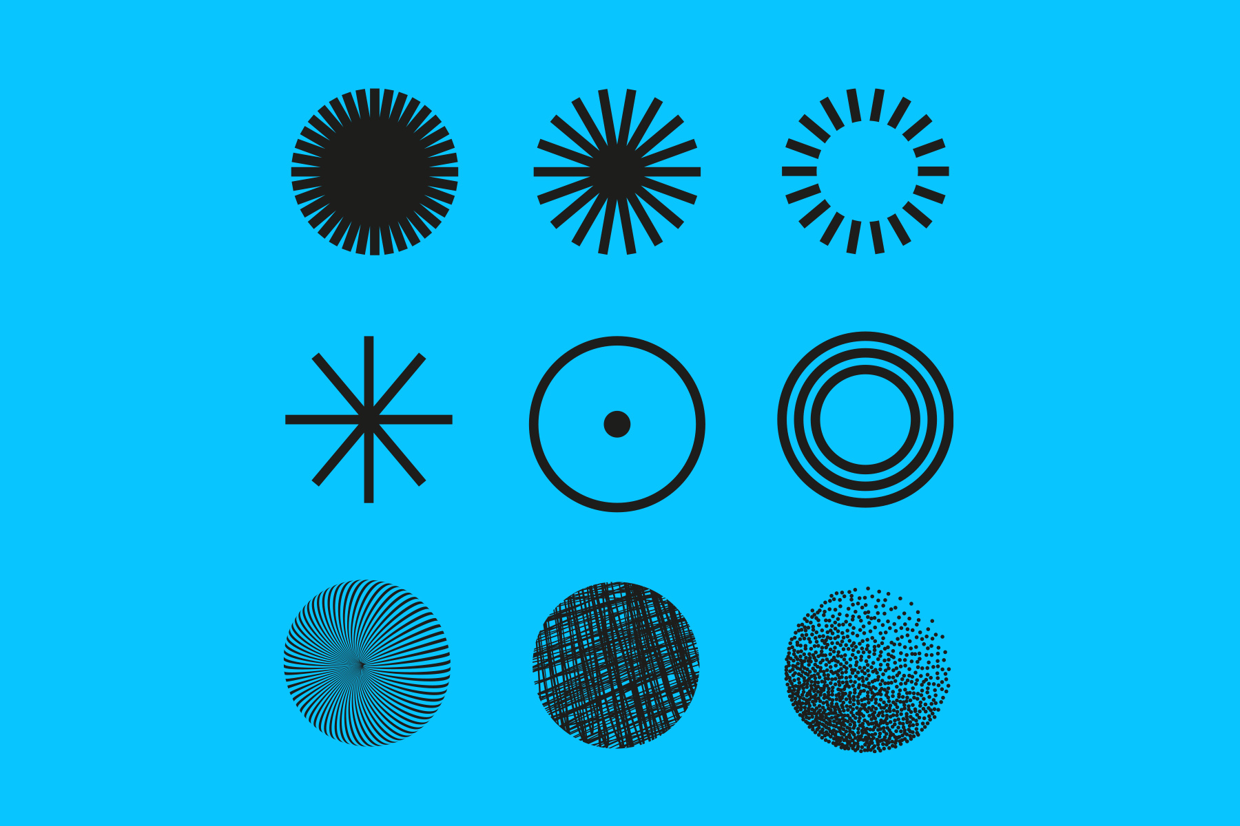
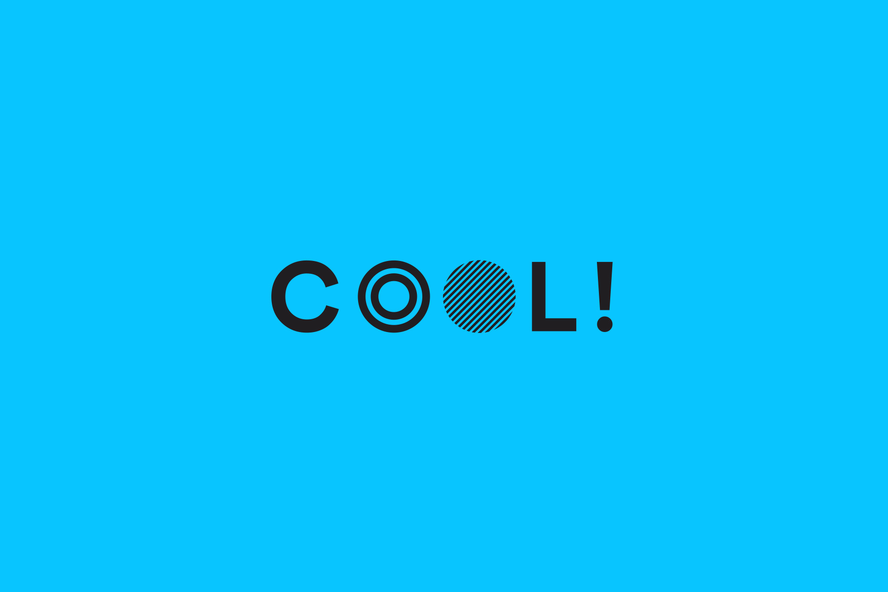
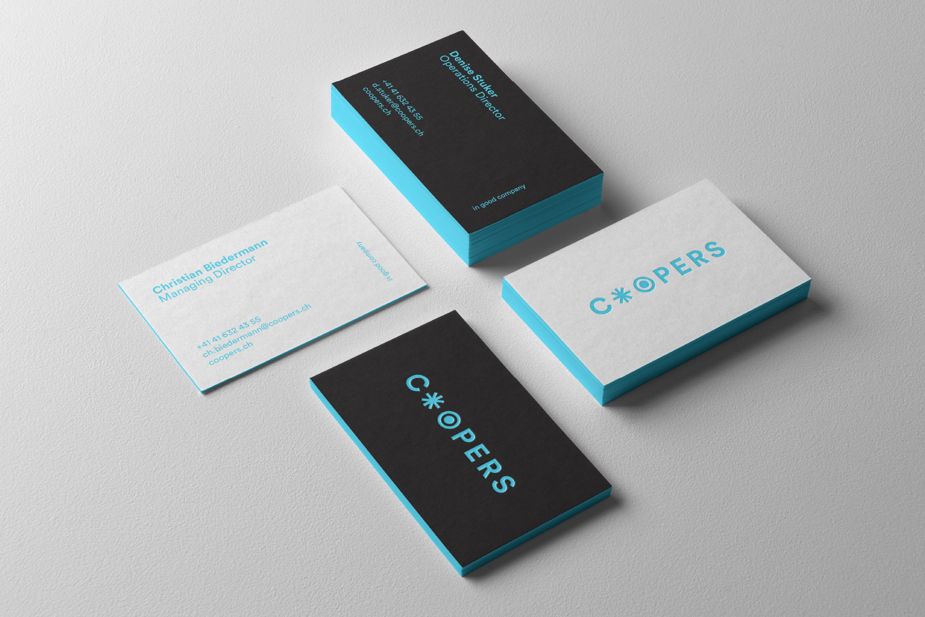
In the new logotype, Julia replaces the two ‘O’s with abstract characters that vaguely resemble a pair of winking eyes. The intervention alludes to the central task of a recruiter: to find and identify the right person, and to match them with the right employer.
The slogans pick up on Coopers’ values and contrast them with the common and often disrespectful habits of the market. As a rebel, Coopers also define themselves by the attitude they reject.
The system works and is coherent in itself. Accordingly, the design, photography and messages are well received – especially in Gstaad, where the brand is presented to employees for the first time.
A comprehensive implementation phase follows, which does not leave print materials, giveaways and the website untouched. At the time of the launch, I breathe a sigh of relief. It finally seems to be done. And I am proud. Of the project, of Julia and Werner – and to a certain extent of myself.
Then something unexpected happens.
But that’s material for another day.
Made by David

Florian Hämmerle
Strategy
Image Concept
Copywriting

Julia Weithaler
Art Direction
Graphic Design
juliaweithaler.com
Werner Streitfelder
Photography
werner-streitfelder.com

Michaela Pichler
Photo Production
Booking
f-6.at

Lore Strelleck
Make-Up Artist
loreart.at

Susanne Präsent
Übersetzung
languagekitchen.at

Daniel Kalkhofer
Image Editing
bagagemusic.com

Florin Buttinger
Microsoft Templates

Moritz Wymann
Programming
suxesiv.ch
Daryna Eder
Sketches
darynchook.com

Andrea Holzner
Conception
holznerandrea.de

