
Customised Imagery
Notes on Branding
“Do you also think this soup tastes funny?” When it comes to our sense of taste, we like to hedge our bets. Does the soup taste a bit like fish to the others? Even when we hear something, we are often not sure: “Is it just me, or is there something beeping?”
The situation is completely different when it comes to what we see. We trust our sense of sight – and that’s a good thing. It provides us with around 80% of all information from our environment. If we were to question every single stimulus, there would be little capacity for anything else. If we see a video in which the text and image contradict each other, we even tend to believe what is shown and think the text is wrong.
How images speak
The written word must be consciously read and decoded: a skill that we learn with difficulty at school.
The visual has its very own language, its understanding is characterised by personal experience and viewing habits. An image has an effect even before consciously analysing it begins.
What is implicit in the visual language is just as important as what is explicit. In the first step of the perception process, we notice colours and shapes. We make our first associations in a fraction of a second. In the second step, we deliberately focus on the elements of an image. However, what we feel and what we think about is actually already clear beforehand. At this point, we are often only looking for the right elements that justify our instinctive reactions and emotions.

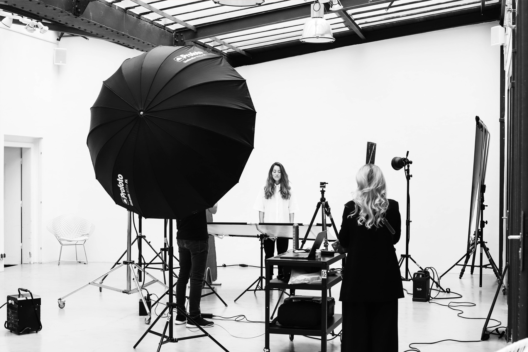
Talentor's image style is based on mugshots.
Photography: Christian Huber

They combine the professional with the emotional side of a personality.
Photography: Christian Huber
Just a nice garnish?
We might not admit it straight away, but if we’re honest, we probably all feel the same way: when we open a magazine, the first thing we do is not jump at an informative article. We are much more likely to flick through the whole magazine first to look at the photos and illustrations. This is also the great strength of successful visual worlds:
Images capture attention and communicate messages – all without much effort from the viewer.
In brand communication, this opens up opportunities to reach people without detours. Images are a kind of virtual store window for a company. As with an store shop window, the aim is to attract the attention of passers-by, arouse their curiosity and, in the best case scenario, lure them into the shop, on both a digital and analogue level.
Write consciously, read unconsciously
Developing your own visual language is an effective way of giving the brand a face and setting it apart from the competition. The quality of the images is not only determined by the strength of the concept, but also by the viewer’s ability to read them.
No matter how eloquent you are about a product, if you do it in Spanish when the other person only speaks English, every word is a waste.
There is always a certain difference between what the designer wanted to say and how the viewer reads an image. In order to meet the language of the target group, you have to be clear: Who sees the image? What do I want to trigger in this person? And in what context do they see the image? Clarifying these questions can significantly minimise the discrepancy. However, if the different perspectives and realities of the viewer’s life are not taken into account, misunderstandings will almost always arise.
Unique versus interchangeable
The message itself needs to be as specific and individual as the audience. If a message is meaningless or interchangeable, the imagery has missed its mark.

Stock photography like this could come from an insurance company. Or a consultant. Or a bank?
Source: Shutterstock

It uses a simple visual code: Attractiveness through beauty. But this also makes it interchangeable.
Source: Shutterstock
Stock photography appears to many companies as a simple and effective solution: a large pool of images can be obtained with relatively little time and financial outlay. However, the content of these images is kept quite general. After all, the image should be sold to as many and therefore very different customers as possible.
When everyone uses the same smiling faces, the products behind them get lost in a random mass. Stock photography tends to lack the corners and edges that catch the eye.
Creativity is required. It’s not about perfect technical execution. An original angle, an unusual staging or a deliberate break in style is much more appealing. Of course, as viewers, we know in theory that photos for advertising campaigns are planned and elaborately photographed. However, we usually find natural photographs that give the impression of a spontaneously captured moment the most appealing.
There’s a little astronaut in everyone
Successful imagery is personal and unique. It embraces the reality of the viewer and creates the possibility of identification. The idea behind the motif should not be too complex – if the viewer has to ponder the meaning for too long, you lose the image’s greatest asset.

epunkts astronaut plays with irritation.
Photography: Nino Havranek

No matter what he is doing. He sticks out.
Photography: Nino Havranek

A symbol for the situation of many candidates: to be born for greater things.
Photography: Nino Havranek

The key visual is suitable as an anchor for a wide variety of narrative strands.
Photography: Nino Havranek
In this case, the astronaut stands for epunkts candidates who are made for greater things and simply don’t fit into their everyday working life. It’s about finding your own place and not being satisfied with half solutions. Whether as an animation on Facebook, a poster or a banner on the website: The astronaut can be found on all channels used by epunkt.
A successful key visual can be used in a variety of ways and is suitable for a wide range of topics and messages. Image and text go hand in hand. In the case of epunkt, the visual language plays humorously with the contrast between the strange and the familiar. The astronaut, who seems so lost and out of place in everyday places, does something to us.
Some viewers are irritated, some laugh and some sympathise. After all, who hasn’t been in his own skin in one way or another?
More than reality
It is not always possible to translate the character of a brand into a photo as well as we can with epunkt. When it comes to abstract topics, photography reaches its limits. Limits that do not exist in illustration.
Illustrations can not only show what is actually visible, but can also help to visualise processes that are complex and difficult to grasp.
We have had our fill of pictures of friendly, smiling people pointing at a screen in an office or gesticulating enthusiastically in a conversation. This was also the case for otago, a Viennese agency that specialises in search engine optimisation and performance marketing, both of which are abstract and difficult to depict with photography. An extensive selection of illustrations of their main areas of work, campaign subjects and infographics/icons make their work more tangible for potential clients.

This also ensures recognisability: an illustrator's style is usually unique.
Illustration: Daryna Eder

It fits seamlessly into the design concept of a branding.
Illustration: Daryna Eder

Illustration like that of otago makes it possible to visualise even abstract concepts.
Illustration: Daryna Eder

Search engine optimisation, performance marketing, social media marketing. All abstract terms.
Illustration: Daryna Eder
The illustration style blends in with the overall design: otago’s characteristic colours are used throughout, and the logo repeatedly appears as part of the illustration. The image can thus be “branded”. The affiliation to the brand is recognisable at first glance.
A newly learnt language opens up a different perspective on the familiar. This applies not only to English or Italian, but also to all other forms of communication.
Pictures are more than just a pretty accompaniment to text. Pictures speak to us. They convey emotions and tell stories. They provide information, visualise the character of a brand and create recognition.
So if we lose ourselves in the images the next time we leaf through a magazine, we certainly don’t have to feel guilty.